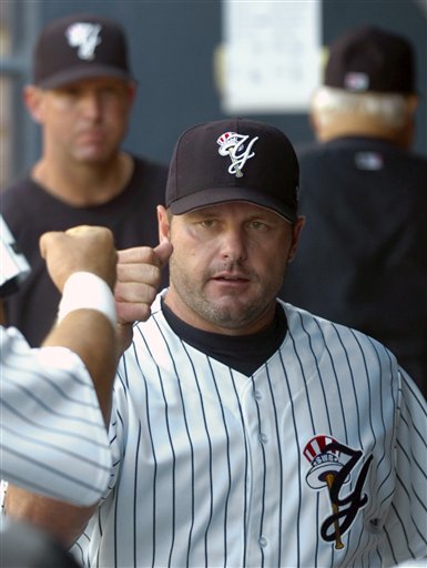
 Roger Clemens wearing the hat and uniform I designed for the Scranton/Wilkes-Barre Yankees, in his Triple-A start yesterday. (Photo by David Kidwell)

Tuesday, May 29, 2007
Making the Best Look Better
Roger Clemens wearing the hat and uniform I designed for the Scranton/Wilkes-Barre Yankees, in his Triple-A start yesterday. (Photo by David Kidwell)


Wednesday, May 23, 2007
Let it Ride!

This is a sign created about two years ago for a casino night party at the day job. It was based on the sign at the classic Sands casino in Las Vegas. This was one of the first times I used the 3D extrusion feature in Illustrator which, I must say, leaves a little to be desired.
Monday, May 21, 2007
Deuce's Family Album
 Deuce's Family Album was created for the Frisco RoughRiders as a renewal piece for season ticket holders. It was designed as a unique way to remind people of all they fun they had at the ballpark with their friends, family, and most importantly, the mascot Deuce (who is, by the way a prairie dog). It was sent with a letter encouraging the individual to renew their ticket package for the following season.
The cover illustrations were sketched with pencil, then scanned and painted in Photoshop.


For the inside front and back covers, I created a pattern in Illustrator, and aged it in Photoshop.

A close-up of the pattern.

The inside of the book was composed of photo-illustrations with brief explanations (written mostly by Justin McCord, with a few additions by me). Also accompanying each image was an icon that represented the era of "family photo", and an image of Deuce with his own visual commentary. The layout was created in Adobe InDesign.


A close-up of Deuce's break dancing cousin.

You can download Deuce's Family Album in its entirety here as a pdf. Please note that images linked from the RoughRiders site as MORE Deuce's Family Album were not created by me.
Tuesday, February 13, 2007
My Neighbor...

Another attempt at the digital paint with good ol' Totoro. I think when I plan on painting these in the future, I will try to keep my sketch as clean as possible. My quick pencil shading on this sketch made it a lot more difficult during the painting process. Baby steps...
Monday, February 12, 2007
First Crack at Painter (with Totoro)

I have finally gotten around to giving Painter a shot. After some brief tips from an experienced friend, I did a quick sketch and starting slapping some pixel-paint on the digital canvas. I definitely will be spending some more time on this guy, and I think it's going to be a while before I am really comfortable with this new tool. But hey, it's a start.
Tuesday, January 23, 2007
Cute Enough To Eat

This is part of a birth announcement for my niece Jo, who was born recently in Japan.
Thursday, January 18, 2007
Hellboy

I sketched this last night while watching the Hellboy movie. This morning, I added the red with white highlights. It turned out being somewhat of a stylistic homage of Dan Panosian's very cool white-out pen sketches.
Tuesday, January 16, 2007
A New Me (In Living Color)!

I first attempted to paint this in Photoshop, but it didn't give me the look I desired. I wanted something a little more clean than my digital painting skills could present, so I attacked it again in Illustrator, and am much more happy with this version. This piece has a lot more gradients than I usually use, but was a good exercise in trying a new look. I think the penguin ended up a bit like a shiny Mac icon.
I appreciate every single person that has dropped by and left a comment! Much to my dismay, when I switched to the new Blogger, some comments were changed to anonymous. I know that all of them from the brilliant Sarah Mensinga were replaced so here is a link to make up for that. Thank you again, it's truly awesome to hear from all you very talented individuals!
Tuesday, January 09, 2007
A New Me (a work in progress)

As part of my new plan of self-improvement, I sketched this guy today with the thought of creating a new, more friendly, avatar.
I said to myself, "Self, now who wouldn't want to click on a cute little penguin?" To which I replied, "Hitler, probably. But I don't want his business anyway." And thus, it was decided.
I wanted the little guy to be pondering what to draw next. Do you think this came across, or does he simply appear to be picking his nose with the pencil?
Monday, January 08, 2007
Figure Drawing 1

Last year, about this time, I took my first ever figure drawing class. And I must say it was long overdue. I don't feel that my skills had ever improved so much in the same period of time. I definitely need to do it more often.
For this piece, the model was laying on his back facing away from me, and I didn't feel a full-body sketch was really that interesting. So, rather than move, I punched in on his face and drew that instead. I think this was a 10-15 minute pose.
Friday, January 05, 2007
Good Enough To Eat
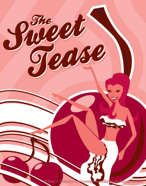
This is a poster I created for the dessert area of a party. There were lots of chocolates and sexy food, so I wanted to make the poster a little sexy to match. I was going for a Shag-like style on the girl, and wanted to make her look like some sort of tasty confection. The overall look I think leans toward a 1970's adult-film poster, which works in a fun way.
Thursday, January 04, 2007
Give Me: Music on Vinyl, Movies on Film, and a Giant Stop-Motion Monkey...
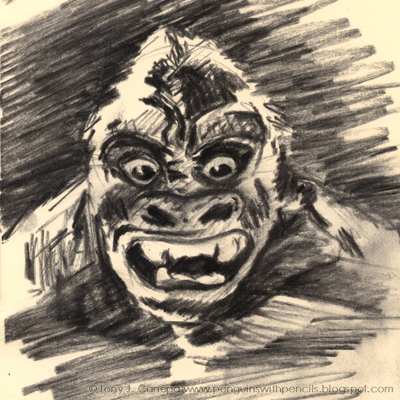
As Sarah mentioned on her blog yesterday, breaking out of your comfort zone is tough. Everyone has that one thing they draw well, or that one medium that feels the best. So, I decided I would follow her lead and try something new today. I have had some charcoal pencils lying around for about a year now, and never really given them a chance. And since I picked up Peter Jackson's King Kong last night, I thought I would do a quick sketch of the original, my favorite, and 100% analog, Lord of the Jungle.
Wednesday, January 03, 2007
Maddy the Squirrel Chaser

This is a quick sketch I did of Maddy, my friend's Italian Greyhound. Maddy happened to be burrowed under some blankets when I sketched this, but I think I captured her "Hey, is that food?!" look pretty well. Maddy also loves squirrels, since they are the only animal she can't catch.
Happy New Year to everyone!
Friday, December 22, 2006
See you in the new year!
I have been working 20 hour days all week with very little sleep, hence the lack of posts. But I promise to do some sketching over the holiday break and bring back some fun. Colorado is getting whacked with snow, and I can't wait to hit the slopes with my brand new snowboard!
Thursday, December 14, 2006
Art makes me thirsty...

This is a companion piece to the previous post. This was for another area at the same party, and I was given no boundaries other than the finished size and the fact that it must include the text "Martini Lounge". I am a big fan of classy art deco, so I decided to go that direction.
Looking at it now, some two years later, I think it needs an accent color to jump out from the grays. Perhaps a bit more red, like in the olive.
Tuesday, December 12, 2006
The Bull
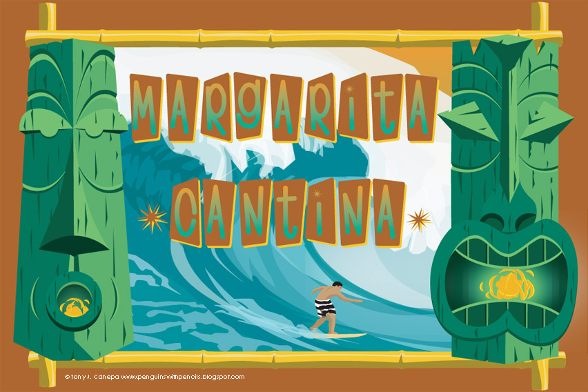
I did this sign for an event that we had at work about two years ago. There were different areas,and I was given pretty much free reign as long as it went with the area's theme. This one was a cantina, and I wanted a tiki vibe, since I happen to like that sort of thing. The surfer is wearing striped trunks a la Greg Noll (nicknamed "The Bull") whom I was a big fan of after seeing the amazing film Riding Giants. The entire piece was done in Adobe Illustrator with some photos of waves for reference. It was printed 24" x 36" and I still have it in my house.
Monday, December 11, 2006
Eye of the Samurai

I did this sketch of a samurai face mask on the plane ride from San Francisco to Tokyo. Whenever I sketch in rectangular sketchbooks, I always end up with one or two of these half-a-face images. I think it's a default setting for my brain when it comes to drawing faces. I just start with the eye and work my way out. I always seem to add a lot of ornate stuff on the face (paint, tattoos, goggles etc.) and they always come out different. I would like to paint this one, using a red and black color scheme.
Monday, November 13, 2006
The Land of Samurai

Tomorrow, I will be leaving for the Land of the Rising Sun, sushi, and (my favorite) samurai! I will spend two weeks in Japan and I hope to get a lot of sketching in. Hopefully I will be able to post a few pics and maybe some drawings.
This logo was a concept I did for a local high school. The colors had to be blue and orange and the mascot options were the Warriors and Wolves (they actually ended up going with the Wolverines, go figure). I wanted to do something different than the usual Native American kind of warrior, so why not a samurai? The similarity to Samurai Jack was not entirely intentional, but I think subconsciously it came out a bit too much. Oh well. But this would have looked really cool on a football helmet, eh?
Monster Bike
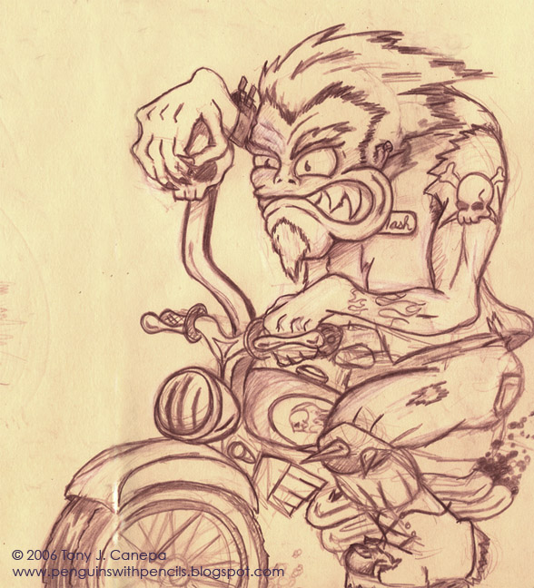
This was sketched in my trusty Moleskine notebook. I highly recommend picking one up yourself. If they were good enough for Hemingway and Van Gogh, they are good enough for you and me. You can find them locally at most Barnes and Noble stores.
In the future I would like to clean this one up, finish out the bike, and add some color. Perhaps this one can be some more practice with digital painting.
Friday, November 10, 2006
The Pajama Jam
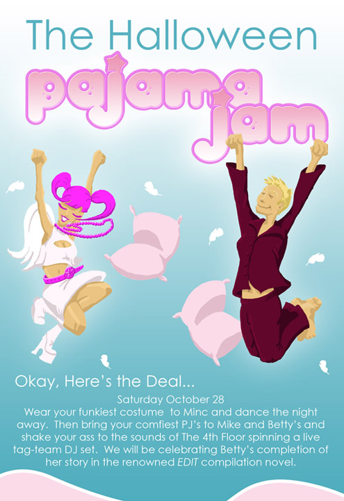
This was a invite for a Halloween party I helped put on. I wasn't 100% happy with the jumping characters, but it wasn't bad for a quickie. It was also one of the first times I have taken a crack at painting in Photoshop.
I think the final layout came together well, and I avoided using the standard black and red or black and orange color schemes you usually see on Halloween invites. I wanted to go less scary, more fun!
The 4th Floor is me and my DJ partner, but the other names and details have been changed to protect the not-so-innocent.
Subscribe to:
Posts (Atom)