

Showing posts with label Illustrator. Show all posts
Showing posts with label Illustrator. Show all posts
Monday, September 05, 2011
FMC Group Inc. Logo Design


Monday, September 20, 2010
Icons

Recently created a set of icons for the Tacoma Rainiers' new stadium. I wanted something that felt clean and new but still had a classic a vibe. I was inspired by the classic WPA National Parks posters from the 1930's and by artist and designer Michael Schwab. Each piece was hand sketched, then rendered in Adobe Illustrator.


Friday, November 20, 2009
Vertical Entertainment Group Logo
 Logo I created for Vertical Entertainment Group, an entertainment and event production company.
Tuesday, June 03, 2008
Hog Heaven
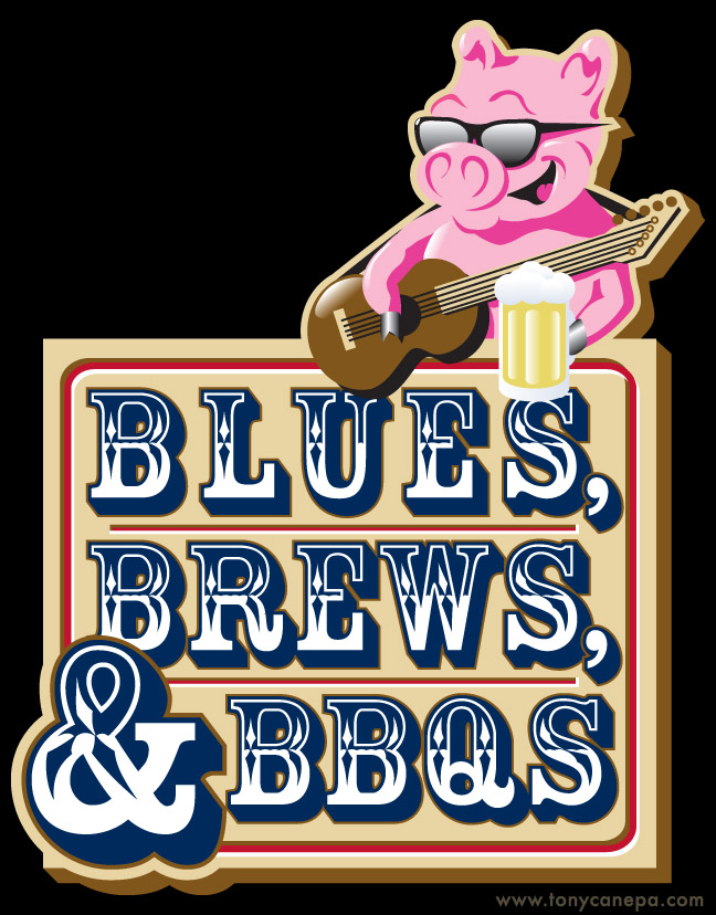
Logo created for the Tacoma, WA "Blues, Brews, & BBQs" festival. It was tough to figure out a fun way to work in the barbecue element, until I remembered something my dad told once. He said, "Always eat at the barbecue place with a pig on the sign." And in my experience that has been sound advice, the best food is always at the place with the pig.
Aside from that, I think it also has a fun "Hitchhikers Guide to the Galaxy" quality, in that this pig is happy to be here, filling your belly.
Tuesday, July 17, 2007
Pick a card...


Here is my brand new business card that I am having printed for the San Diego Comic-Con and all points beyond. If you run into me at the Con I will be happy to give you one for your very own. Right now, TonyCanepa.com will redirect you back here, but I will be working hard to get a full-fledged portfolio up very soon.
Wednesday, May 23, 2007
Let it Ride!

This is a sign created about two years ago for a casino night party at the day job. It was based on the sign at the classic Sands casino in Las Vegas. This was one of the first times I used the 3D extrusion feature in Illustrator which, I must say, leaves a little to be desired.
Monday, May 21, 2007
Deuce's Family Album
 Deuce's Family Album was created for the Frisco RoughRiders as a renewal piece for season ticket holders. It was designed as a unique way to remind people of all they fun they had at the ballpark with their friends, family, and most importantly, the mascot Deuce (who is, by the way a prairie dog). It was sent with a letter encouraging the individual to renew their ticket package for the following season.
The cover illustrations were sketched with pencil, then scanned and painted in Photoshop.


For the inside front and back covers, I created a pattern in Illustrator, and aged it in Photoshop.

A close-up of the pattern.

The inside of the book was composed of photo-illustrations with brief explanations (written mostly by Justin McCord, with a few additions by me). Also accompanying each image was an icon that represented the era of "family photo", and an image of Deuce with his own visual commentary. The layout was created in Adobe InDesign.


A close-up of Deuce's break dancing cousin.

You can download Deuce's Family Album in its entirety here as a pdf. Please note that images linked from the RoughRiders site as MORE Deuce's Family Album were not created by me.
Tuesday, January 23, 2007
Cute Enough To Eat

This is part of a birth announcement for my niece Jo, who was born recently in Japan.
Tuesday, January 16, 2007
A New Me (In Living Color)!

I first attempted to paint this in Photoshop, but it didn't give me the look I desired. I wanted something a little more clean than my digital painting skills could present, so I attacked it again in Illustrator, and am much more happy with this version. This piece has a lot more gradients than I usually use, but was a good exercise in trying a new look. I think the penguin ended up a bit like a shiny Mac icon.
I appreciate every single person that has dropped by and left a comment! Much to my dismay, when I switched to the new Blogger, some comments were changed to anonymous. I know that all of them from the brilliant Sarah Mensinga were replaced so here is a link to make up for that. Thank you again, it's truly awesome to hear from all you very talented individuals!
Friday, January 05, 2007
Good Enough To Eat
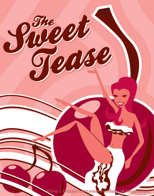
This is a poster I created for the dessert area of a party. There were lots of chocolates and sexy food, so I wanted to make the poster a little sexy to match. I was going for a Shag-like style on the girl, and wanted to make her look like some sort of tasty confection. The overall look I think leans toward a 1970's adult-film poster, which works in a fun way.
Thursday, December 14, 2006
Art makes me thirsty...

This is a companion piece to the previous post. This was for another area at the same party, and I was given no boundaries other than the finished size and the fact that it must include the text "Martini Lounge". I am a big fan of classy art deco, so I decided to go that direction.
Looking at it now, some two years later, I think it needs an accent color to jump out from the grays. Perhaps a bit more red, like in the olive.
Tuesday, December 12, 2006
The Bull
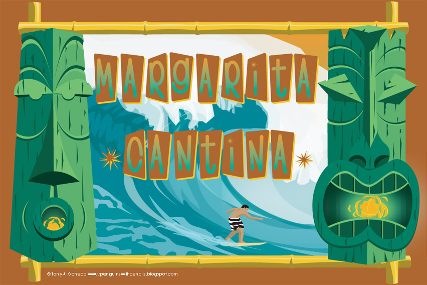
I did this sign for an event that we had at work about two years ago. There were different areas,and I was given pretty much free reign as long as it went with the area's theme. This one was a cantina, and I wanted a tiki vibe, since I happen to like that sort of thing. The surfer is wearing striped trunks a la Greg Noll (nicknamed "The Bull") whom I was a big fan of after seeing the amazing film Riding Giants. The entire piece was done in Adobe Illustrator with some photos of waves for reference. It was printed 24" x 36" and I still have it in my house.
Monday, October 30, 2006
Fresh Out The Box!

Welcome to Penguins with Pencils: The Art and Design of Tony J. Canepa. This blog will be home to my online portfolio until I get my website up and running. Thank's for stopping by my little corner of the internet.
Hail to the King, Baby!
Subscribe to:
Posts (Atom)